
When we launched Daffy in September 2021, the idea was simple: take all of the amazing technology and innovation from modern fintech applications and use it to help people be more generous, more often. Daffy launched the first fully functional donor-advised fund in the Apple App Store, and not surprisingly, our simple and modern approach earned praise from our members. One member even called the experience “smooth as butter.” ☺️
2023 was a ground-breaking year for our platform and community. With thousands of new members onboard, contributions surged by 425% to over $105 million, and donations increased by more than 200%. A lot of this growth is due to our pace of innovation — over the last two years, we have rolled out an amazing array of new features: Daffy Gifts, Daffy for Families, Daffy for Advisors, new crypto portfolios, Daffy for Work (our award-winning employer-giving solution), and Daffy Campaigns.
All of that innovation, however, comes at a cost, both from a technical and design perspective. Grafting one feature after another onto an interface adds complexity, almost like a cognitive tax paid by every developer working on the product and every member using that product. More importantly, when we launched Daffy, we lacked real data on what our members would find the most valuable, and which features our members would access most frequently.
While it is popular in Silicon Valley to talk about the challenges of going from zero to one, today we are excited to announce the next step for Daffy.
We call it Daffy 2.0.
Redesigning Daffy, the Donor-Advised Fund for You™
One of the hardest decisions that even experienced software engineers and designers make is when to simply add to an existing application and when to redesign. While there is no one answer to this question, the best in the industry operate with a type of paranoia that comes from knowing that if they had a chance to rebuild the application today, knowing what they know now, they could do it better.
At some point, however, you have a choice. Leverage the feedback and data from your members to rethink your design architecture, or watch your product stagnate and your customer engagement decline. At Daffy, we have chosen to be proactive about our product design.
Unfortunately, we don’t have the luxury of learning from our competition. Our MVP design still reflects a massive leap ahead of the incumbents in the space, our bar for quality is much higher. Most donor-advised funds on the market think of themselves as just a type of financial account, a tool to store money and invest it tax-free for charity. At Daffy, we have a much more ambitious view of the product, a belief that our members are looking not only for a better system for their giving, but also a platform that inspires them.
After feedback from dozens of customer interviews, our team of talented designers decided to rethink our member experience from the ground up. Our engineering team rebuilt our front-end architecture to not only display comprehensive information about contributions and donations, but also make every display actionable for our members. After all, our mission at Daffy is to help people be more generous, more often.
Sometimes the best thing you can do for a product architecture is simplify and prioritize. Not only do you end up with a better product today, but you also provide the space for future innovation.
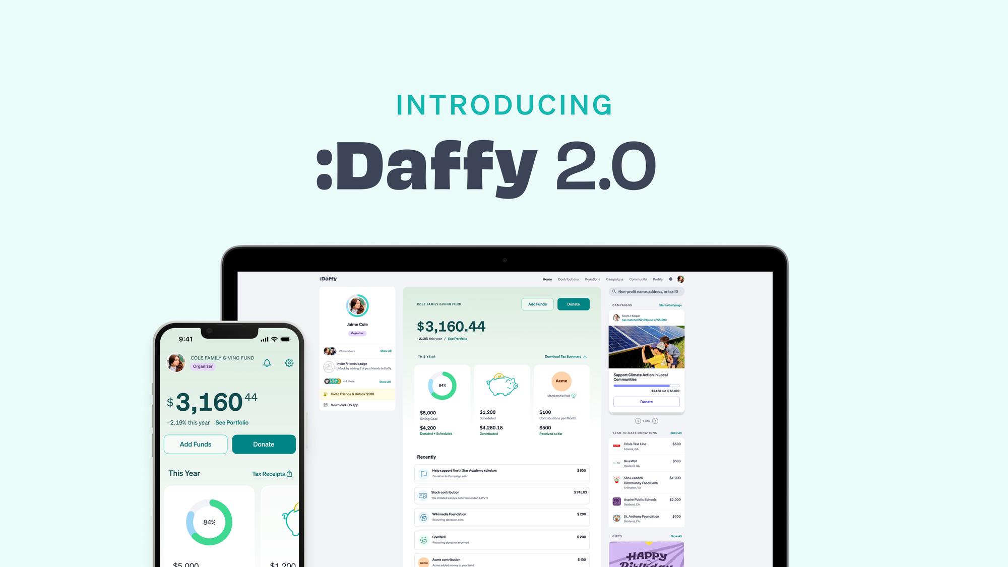
The result is an entirely redesigned dashboard, serving as the hub of all your giving, from adding funds to tracking the status of a particular donation to initiating fundraising campaigns.
Diving into Daffy 2.0

The first thing you will notice about the new Daffy is that we’ve divided it into three distinct sections. The leftmost section showcases your philanthropic identity, housing your Daffy profile, fund member, and the fun badges you’ve earned for your generous actions on Daffy.
The main section focuses on your fund: its balance, investment performance, and essential actions like “Add Funds” or “Donate” at the top and your giving activity below. Not surprisingly, the most important action on Daffy is giving, and we have simplified and cleaned up the dashboard to make it even easier to give.
The section on the far right focuses on discovery and inspiration. Here, you can easily search for non-profits to support, see live campaigns by fellow Daffy members, launch your own campaigns, see donations you’ve made, and even send a Daffy Gift— a charitable gift card— to a friend.
The Giving Dashboard
In the ‘This Year’ section, you’ll find your progress towards your giving goal, scheduled and complete donations, and your scheduled and completed contributions. And for those fortunate enough to have their employer providing Daffy for Work as a benefit, they will be able to see and track the amount of contributions granted to them.
One of the most loved features of Daffy is easy access to all of your charitable tax receipts, and we have been surprised as how many of our members want access to those receipts any time. Our new dashboard elevates the Tax Summary to the very top of the screen, and we don’t wait until February 1st to give you a tax summary. The Tax Summary is always up-to-date and available to download in PDF or CSV format.

The main dashboard also features a recent activity section that has been redesigned from the ground up to not only capture all of your giving activity, but also provide quick access to the information and actions you need.

Want to donate to an organization you recently supported? Simply tap and select ‘Give Again’. 🥰 Are you keen on tracking the status of a specific donation? We now show the donation status every step of the way, giving you the reassurance that your funds will have the impact you want.

Want to see the status of a recent contribution? You can simply select and view updates, so you can rest assured whether it’s cash, stock, or crypto, your money is on its way, or has made it to your fund.

Be More Generous in 2024

Whether you’re a longstanding Daffy member or a newcomer, thank you for being a part of this journey to 2.0. Your generous actions and feedback are what got us here. And we are excited for you to experience firsthand the difference this revamped interface brings to your giving experience.
While we are proud of our functional and design improvements to the new dashboard, we also hope you’ll appreciate some of the small touches of delight that the team added with this release.
Giving is not just a financial transaction. It’s a meaningful experience, for both the donor and the recipient, and we continue to see great opportunity around bringing that humanity into our platform.
So make a contribution, set up a recurring donation, or even launch a campaign. Set a goal for your giving, and celebrate when you hit it.
And if you haven’t tried Daffy yet, there’s no better time than now to set up a better system for giving in 2024. We’ve set out to build a platform to help you be more generous, more often, and we hope you join the thousands of members already on the platform.
We’re just getting started.